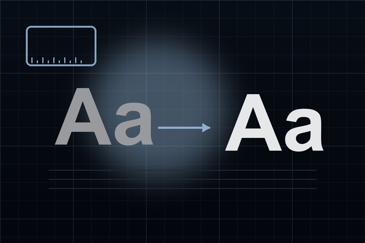
The 2026 Font Loading Reality
On real networks, web fonts don’t always arrive instantly. What matters is how your page behaves while they load:
- FOUT (Flash of Unstyled Text) is usually acceptable
- CLS (layout shift) damages UX and Core Web Vitals
In 2026, the goal is simple: show readable text immediately, and keep layout stable.
Step 1: Use font-display intentionally
For most content sites, swap is the pragmatic default:
@font-face {
  font-family: "Brand Sans";
  src: url("/fonts/brand-sans.woff2") format("woff2");
  font-display: swap;
}
If you serve large fonts or many weights, keep the payload lean. Format guidance: WOFF2 vs WOFF vs TTF vs OTF.
Step 2: Pick fallbacks that are metrics-compatible
A fallback is not just “any sans-serif.” You want similar:
- x-height
- ascender/descender heights
- letter widths (especially for headings)
Bad metrics matching = big reflow when the web font loads.
Step 3: Use size-adjust and metrics overrides (when supported)
Modern CSS lets you tune fallback behavior to reduce shifts:
@font-face {
  font-family: "Brand Sans Fallback";
  src: local("Arial");
  size-adjust: 105%;
  ascent-override: 90%;
  descent-override: 22%;
  line-gap-override: 0%;
}

body {
  font-family: "Brand Sans", "Brand Sans Fallback", system-ui, -apple-system, Segoe UI, Roboto, sans-serif;
}
You don’t need perfection — you need close enough that the swap doesn’t move the page.
Step 4: Don’t ship unnecessary weights
The easiest performance win is still: ship fewer files.
- Use 2–3 weights max unless your design system truly needs more
- Consider variable fonts when it reduces overall bytes: Variable Fonts Explained
- Subset only when permitted: Font Subsetting
Licensing Note
None of these techniques change licensing. A metrics-tuned fallback stack is a performance choice — you still need valid rights for any commercial font you embed.
If you’re unsure, start with: Font Licensing 101.
Conclusion
Great typography in 2026 is as much about loading strategy as it is about font choice. Use swap, match fallback metrics, tune with size-adjust and overrides where appropriate, and keep your font payload lean — your users (and your Core Web Vitals) will thank you.